- 首页
- International
- 艾特奖
- 文化节
- 服务体系
-
网站导航
在设计的开始,我们提取了汉堡的经典形象中夹心的元素,夹心是汉堡的品质核心。品牌logo形象也来源于对汉堡经典形象的解读。
To start the concept-design, we used the most important part of the burger, the patties and topping, as the main idea of Adangs logo.Simplest way to tell everyone that we focused on the the most critical part, just like Adangs does.
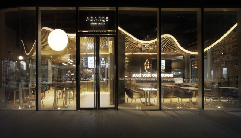
空间设计上结合品牌视觉形象的黑金色调设计,店铺空间也运用了大量的黑金色块。主次双入口设计最大化链接商城人流,入口直面服务台,就近设置自助点餐机。
Like the logo, we used black and gold to continue the Visual Identity design in the lobby.There are two entrances, one for the shopping center and one for the business building. The counter is located at the center of the restaurant and with Self-Service Kiosks which is near the main entrance.
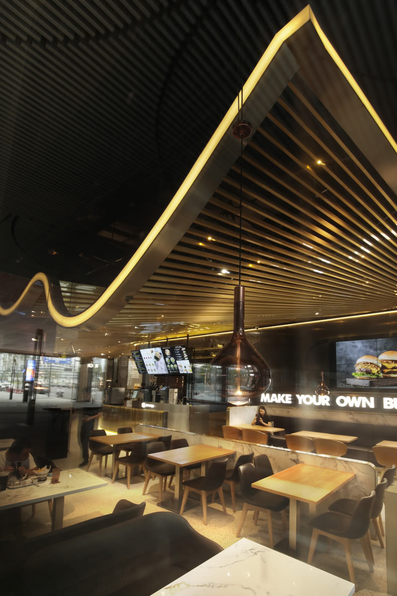
异形吊顶运用金属格栅创造出飘动的视觉效果,呼应了汉堡的核心——柔软美味,又与原始空间内锋利刚硬的几何线条碰撞出空间的触觉美感,在使用功能之上增加了美学关怀。
We used waving ceiling of metal grille to show the soft and essence of burgers. Besides the basic light functions, the ceiling curves make the original space become more touching.
厨房空间与出餐点餐空间整体设计,形成服务中岛;就餐区环绕着中岛设置,实现了最佳的服务效率与最高效的餐厨功能。与此同时开放的厨房界面使得顾客能直观运作中的厨房,可见的原材料与加工让人心安。
To improve service efficiency, we set about eighty seats and put the service bar in the middle. The open kitchen ensures customers could see all the burger ingredients and the cooking steps.
温润桌椅配合冰冷奢华的大理石平衡温度感受。深色金属与石材增加了空间重量,令人感到稳重和具有安全感,起伏的金属吊顶勾勒出空间的流动感。保留场地中的落地玻璃,白天引入室外光线,灯光从上方的金属格栅中穿过使氛围更加柔和舒适。
Furnishing with warm color table enable to balance the cold color tone on the luxury marble decoration. The dark metal and stone materials let the atmosphere become stable and magnificent. This undulating outlines create the spaciousness and the surrounded glass wall brings the brightness with the sunlight. At night, the light pass through the metal grille make the atmosphere comfortable and gentle.
如Adangs创始人所言“我们拥有可个性化定制的汉堡,也希望为顾客提供与之相应的独特用餐体验”,在这个汉堡空间设计中没有常规店铺的影子,“”美味夹心“”是一个专为轻食汉堡而定制的空间。
Unlike other ordinary ones, Adangs provides personalized burgers and unique eating experience space. We hope to makes everyone feels that this specialized space is perfectly designed for the burger shop. Makes the design full of every corner in your life. The unusual design by Usual design.
作品名称:美味夹心—杭州ADANGS新概念汉堡店
室内设计:寻常设计Usual Studio
主创设计师:林经锐
设计团队:王坤辉,温馨,黄舒迪
项目地点:中国,杭州
建筑面积:230㎡
项目时间:2018-2019年 设计+施工
摄影师:阿邓


