- 首页
- International
- 艾特奖
- 文化节
- 服务体系
-
网站导航
大喜家DAXI STUDIO
大喜家 | DAXI STUDIO,一家潮流品牌集合店,本次SHURUI术锐设计受邀为其设计线下潮牌集合店。我们将主理人coco女士谈及的「家」蕴含包容与成长的概念融入其中。
Daxijia | DAXI STUDIO, a trend brand collection store, this SHURUI design was invited to design an offline fashion collection store. We incorporate the concept of tolerance and growth in the “home” that Ms. Coco talks about.
作为一间时尚体验空间,不墨守陈规。DAXI STUDIO基于主理人独到而敏锐的时尚嗅觉,每一面都是独立的风景,希望客人可以找到消费场景的时髦感和舒适度。
As a fashion experience space, do not stick to the rules. DAXI STUDIO is based on the unique and keen sense of fashion, each side is an independent landscape, I hope that guests can find the fashion and comfort of the consumer scene.
低调的高级感 | 与时尚相融的气场
Low-key sense of luxury | a gas field that blends with fashion
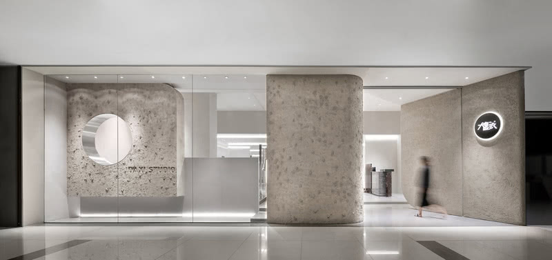
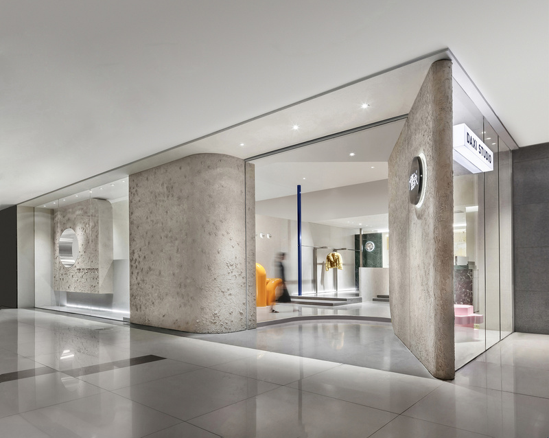
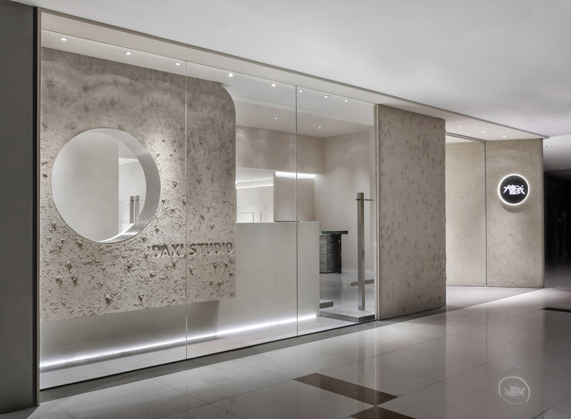
根据商场人流动线将入口放置在右前方,倾斜的肌理墙以一定角度将客人迎至店内。结合玻璃的干净通透和圆形的镂空营造出典雅的高质感格调。
The entrance is placed in the right front according to the mall's flow line, and the inclined texture wall welcomes the guests to the store at an angle. The combination of clean, transparent glass and round cutouts creates an elegant, high-quality finish.
SHURUI术锐设计将商业与时尚相结合,整个空间以平静的素色为基调,融入了艺术涂料的肌理质感及大理石光泽作为材质上的延伸,呈现了简洁又不失细节与品质的空间。
SHURUI design combines business and fashion. The whole space is based on calm and plain color. It incorporates the texture of art paint and marble luster as an extension of the material, presenting a space of simplicity and detail without losing detail.
极简主义的店铺陈设、灯光设计和大块面的立体造型结合,融入当代建筑空间元素,更好的构筑了多元化的空间,进行一场独一无二的体验。
The combination of minimalist shop furnishings, lighting design and large-scale three-dimensional modeling blends into the elements of contemporary architecture to better create a diverse space for a unique experience.
纵向延伸的墙面将空间一分为二,外侧更具开放性,而内侧相对更私密。顶部的架构贯穿两侧,又削弱了它的分离性,重塑了空间的结构美感。
The longitudinally extending wall divides the space into two, with the outside being more open and the inside being relatively more intimate. The top structure runs through the sides, weakening its separation and reshaping the structural beauty of the space.
利用原始建筑的层高优势,整个空间保留建筑感的形式,顶面做了结构穿插,呼应「家」理念中的屋顶。
Taking advantage of the layered height of the original building, the entire space retains the architectural form, and the top surface is interspersed with the structure, echoing the roof of the “home” concept.
渐进式台阶引导人流拾阶而上,一探内里究竟,当代的结构并组,使陈列更具有层次感。
The progressive steps guide the flow of people to pick up the stairs, and explore the inner structure and the contemporary structure to make the display more layered.
家的概念 | 品牌多元化与包容性
Home Concept | Brand Diversity and Inclusiveness
家最容易给与内心满足感,承载着独立成员多元化的个性,涉及各方面,融合对摄影,艺术,建筑,绘画等美的认知。
The home is the easiest to give inner satisfaction, carrying the diverse personality of independent members, involving all aspects, integrating the recognition of photography, art, architecture, painting and other beauty.
兼顾隐私又不至于完全封闭,同时利用几何线条,将空间分割成不同的区域以增加关联。
阵列的货架,营造交错丰富的场景感,打破固有空间的呆滞,制造一种动感的视觉。
内侧空间划分单独休息区,放置的沙发和茶几如家般轻松愉悦。
Taking into account privacy and not completely closed, while using geometric lines, the space is divided into different areas to increase the association.
The array of shelves creates a staggered and rich sense of scene, breaking the slack of the inherent space and creating a dynamic vision.
The inner space is divided into separate seating areas, and the sofa and coffee table are as relaxing and pleasant as home.
极简的顶地连接货架与圆柱形亚克力长条灯无不体现着空间的点线面的理性排列组合。侧面内嵌的灯条冲淡了不锈钢的清冷,地面焕发出一道道柔和的光线,反射在墙面,墙也开始腾云驾雾漂浮了起来。
The minimalist top-floor connection shelf and the cylindrical acrylic strip light all reflect the rational arrangement of the dotted surface of the space.The light strips embedded in the side dilute the coldness of the stainless steel, and the ground glows with soft light, reflected on the wall, and the wall begins to float and float.
你能看到顾客在各处与服饰产生对话,互动,探索,交流,这样的氛围其实都是由顾客本身自发营造的。
You can see that customers have dialogues, interactions, explorations, and exchanges with clothing. The atmosphere is actually created by the customers themselves.
材质的碰撞 | 空间趣味
Material collision | space fun
墙面富有节奏感的四个小洞打破了冗长的沉闷,空气得以游行其中。
The four small holes in the rhythm of the wall broke the lengthy dullness and the air was able to march.
肌理感的艺术漆致敬大自然的粗野主义,与极简主义美学完美结合,看似未经雕琢的粗糙表面更反衬了空间的纯粹。
The artistic paint of the sense of texture pays homage to the wildness of nature and the perfect combination with minimalist aesthetics. The seemingly unfinished rough surface contrasts the purity of space.
大理石、金属、木质所呈现的活力感使空间更具多样化和包容性。
The vitality of marble, metal and wood makes the space more diverse and inclusive.
矮墙的围合,高墙的屹立,斑驳的带有历史痕迹的艺术漆墙面,勾勒出过往的记忆,与金属呈现的现代属性形成落差。
The encirclement of the low walls, the standing of the high walls, the mottled art paint wall with historical traces, outlines the past memories, and forms a gap with the modern attributes of metal.
顶面和立面艺术漆的细腻与地面灰色水磨石的碰撞
The fineness of the top and facade art paints collides with the ground gray terrazzo
高饱和度的亮黄色弯管与海军蓝道具构成的趣味艺术装置,关于时尚的一点一滴,它们在这里发生碰撞,产生化学反应。
Highly saturated bright yellow curved tubes and navy blue props constitute a fun art installation, about fashion, they collide here and produce chemical reactions.
SHURUI术锐设计从空间独特的定位入手,与品牌达成契合,诠释她们的生活态度,在这儿时尚毫不费力。
SHURUI design starts with a unique positioning of space, and it is compatible with the brand to interpret their attitude towards life. It is effortless in fashion here.

w1

w2

c1