- 首页
- International
- 艾特奖
- 文化节
- 服务体系
-
网站导航
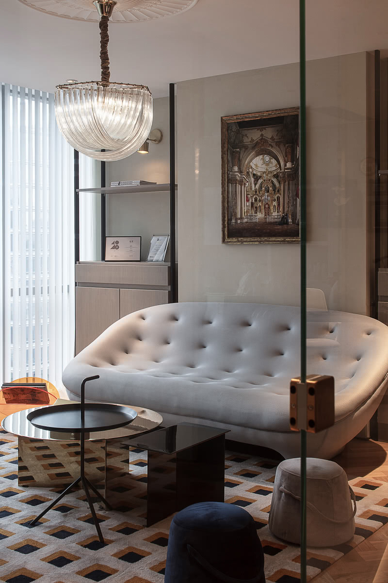
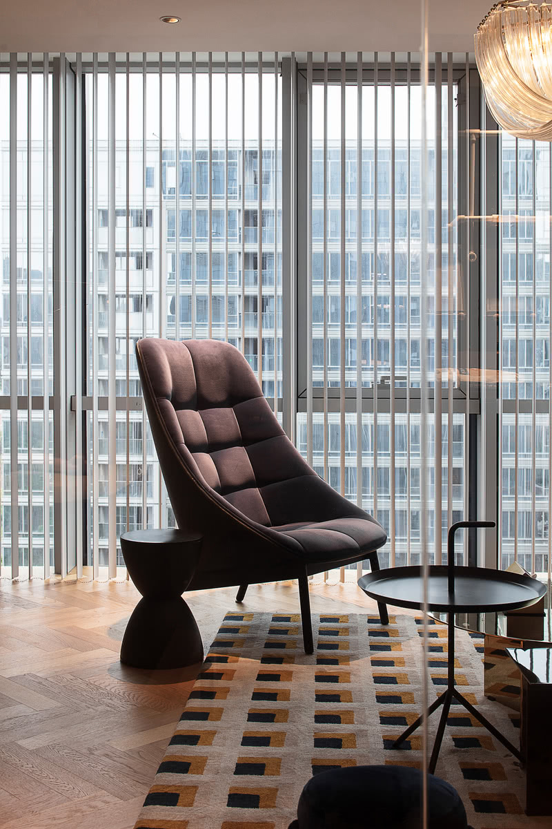
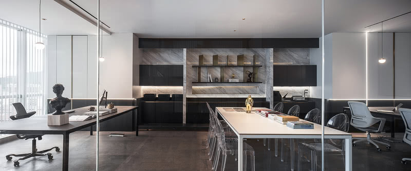
这是位于舟山CBD商圈一家设计公司的案例,由子洋设计的朱晓东主案,团队设计师配合一起完成的办公空间。在后期的设计中,考虑到每个区域的采光和各个部门间的沟通便利性,保留了原有空间的人物流线,最后用大量直线的方式诠释了空间。大面积的清水混凝土的灰色和局部的黑白色形成了空间的主色调,同时用金属色作为跳色完美地融入于整个空间中。
This is a case of a design company located in Zhoushan CBD business district. The office space is designed by Zhu Xiaodong of Ziyang design, and completed by the team designers together.In the later design, considering the lighting of each area and the convenience of communication between various departments, the original space of the character streamline is reserved, and finally the large space was used the way we measure lines is to interpret space. The grey of the large area of fair-faced concrete and the local black and white form the dominant tone of the space, while the metallic color is used as the color jumping is perfectly integrated into the whole space.


