- 首页
- International
- 艾特奖
- 文化节
- 服务体系
-
网站导航
当世界变得越来越复杂,我们越来越向往简单的生活。不必线条曲折,不必装饰繁复,不必色彩缤纷,简洁明了的直线、几何形状的图纹以及纯粹的黑白灰,恰能让漂浮的心安静下来。
回归简单,从“头”开始,TONI&GUY 汤尼英盖美发沙龙在设计中所秉持的理念正是如此。以硬朗直线和简单色搭构成的美发空间,有着与生俱来的高级感与纯净感,一段呵护秀发的时光,也可以成为一场释放心情的旅程。
在TONI&GUY,玻璃的运用可谓淋漓尽致。首先是门头的一整面玻璃墙,清澈纯透的玻璃介面打破商场与沙龙的隔阂,让过往来客一目了然门店主题,空间极具穿透感。
透过玻璃,面对TONI&GUY黑白极简的造型风格,总忍不住多看几眼,不知不觉便已在潜意识中留下尊贵印象。
迎门的洁白墙面摒弃多画幅的做法,只用一张时尚感爆棚的大海报,“less is more”的高级格调扑面而来。墙面隔开美甲区与美发区,区别出段落独立的机能分野,让每一位客人都享有不被干扰的自在。
TONI&GUY的主体空间采用黑白设色的彩度布局,光洁的台面与雅白橱柜形成强烈的视觉冲击,而灰色系地面恰恰在二者之间形成优雅过渡,吊顶上偏冷蓝的灯光点亮视野,为空间蒙上一层清爽气息,置身其中,赏心悦目。
宽敞的空间整齐缀入不落地的沙发款式,不仅满足美发功能需求,而且让临场视觉显得格外轻盈飘逸。
洗头间采用了偏暗的光线设计,墙面的钢琴黑和珍珠白呼应有致,构成简洁的时尚语汇。躺椅之间用高度正好的隔板隔开,很好地保护着客人的隐私。顶棚采用了半弧形设计,延展了空间感,颇有艺术韵味。
黑色镜框使镜子完美融入墙面环境,伴以现代风格的落地灯,充满私人订制的尊贵感。
圆镜中和了空间的锐度,典雅、精致并活泼灵动,较小的占面使角落空间不至有狭窄感,科学利用了每一寸珍贵空间。
美甲美睫区设置了游刃有余的开放式宽敞柜面,顾客对各色产品一览无余,设计师亦能随手拿取,便捷省力。
吊灯的选择独具匠心,灯线与灯身的大小三角形相映成趣,简洁中又充满韵律和设计感,犹如空间音符,叮咚悦耳。
木色和雅白拼接的长台面简约大气,充满厚实稳重的质感,不动声色地为顾客划分出“自留区”,带来自然舒适的体验。
因为玻璃而产生的交错空间,仿佛维度重叠。中部的黑色品牌壁贴强化空间专属,提醒顾客:这是TONI&GUY独有的气质与服务品质。
纯白的落地帘被高低相错的小球灯点亮,为空间平添了几分可爱萌动的气息。一面是宛如living show的拼接海报墙面,以年份标记不同图张,诠释着TONI&GUY一路走来的时尚追求,让空间有了丰富的内容。
上下映照的光线组成漏斗般的造型,渐进融入墙壁,仿佛整面墙都被这小小的壁灯点亮。
THE END
以“极简风”和“品质感”为方向打造的TONI&GUY美发沙龙,将时尚美观与功能性巧妙融合,在美发师的专业需求和顾客的体验之间寻求最佳平衡,布局并不复杂,却处处透着为顾客着想的用心。
As the world becomes more and more complex, we become more and more yearning for a simple life. There is no need for twists and turns of lines, complicated decorations, colourful colors, simple straight lines, geometric patterns and pure black and white gray, which can make the floating heart quiet.
Back to simplicity, starting with the “head,” TONI&GUY Toni’s ingay salon is designed to do just that. With hale and hearty line and simple color build the hairdressing space that compose, it has inherent high level feeling and pure feeling, a period of time that caresses beautiful hair, also can become a journey that releases the mood.
In the use of TONI&GUY, glass can be said incisively and vividly. First of all, the door head of a whole glass wall, clear and pure glass interface to break the barrier between the mall and salon, so that the past visitors at a glance store theme, the space has a sense of penetration.
Through the glass, facing the TONI&GUY black and white minimalist styling style. I can not help looking at a few more, unconsciously has left a noble impression in the subconscious.
Welcome door pure white wall to abandon the practice of multi-picture. It’s just a stylish poster. The advanced style of “less is more” came on the horizon. The wall separates the manicure area from the hairdressing area, which distinguishes the paragraph from the separate function, allowing each guest to enjoy undisturbed freedom.
The main space of TONI&GUY adopts black and white color scheme. Bright and clean mesa and elegant white ambry form strong visual impact. And the ground of gray department just forms elegant transition between them. The lamplight on condole top slants coldly blue illuminates visual field of vision, cover for the space a layer of relaxed breath, place oneself among them, aesthetic feeling is pleasing to the eye.
Capacious space decorates the sofa design that does not fall to the ground neatly, satisfy hairdressing function demand not only, and let the vision of the scene appear all the more lightsome elegant.
Here, the glass comes back in the form of a hairdressing mirror. It uses the square and circular two forms, a good way to avoid the sense of stiffness, increased the activity of space and sense of intelligence. All the side walls are designed for glass walls to maximize the indoor natural lighting, space into the outdoor flowers and trees, but also clear and fresh.
The shampoo room is designed for dark light. The piano black and pearl white on the wall echo well and form a concise fashion vocabulary. The lounge chair is separated by a precisely high partition, which protects the privacy of the guests. The roof adopts the half-arc design, extends the space feeling, quite has the artistic charm.
There is also a large landing mirror, the black frame makes the mirror perfect into the wall environment, with a modern style floor lamp, full of private customized sense of honor.
The round mirror neutralizes the sharpness of the space, elegant, refined and lively. The smaller area allows the corner space not to have a narrow sense, which scientifically uses every inch of precious space.
Nail beauty ciliary area set up an open and spacious cabinet, customers of all kinds of products at a glance, designers can also take it, convenient and labor-saving.
The choice of chandeliers is unique. Lamp line and the size of the body of the light into a triangle, simple and full of rhythm and design sense, as if the space notes, Ding Dong pleasing to the ear.
Wood color and elegant white splice the long table surface simple atmosphere, full of thick and steady texture. It quietly divides the customer’s “retention area” to bring a natural and comfortable experience.
Glass once again sublimated vision. This time it is separated by sliding doors to separate different functional areas. In addition to the introduction of complete lighting, it opens the unobstructed field of vision. The mirror uses the tone with blue filter to create a bit of romantic feelings. TONI&GUY is your dream hairdressing show.
The interlaced space created by glass seems to overlap in dimensions. The middle of the black brand wall mount strengthens the space exclusive. Remind customers: this is TONI&GUY’s unique temperament and service quality.
The pure white floor curtain is lit up by the small ball lamp with the wrong height and height, which adds some lovely breath to the space. On one side is the wall of a spliced poster like living show. It marks different pictures by the year, annotating the fashion pursuit of TONI&GUY all the way, so that the space has rich content.
Wall lights are very artistic. The light reflected above and below formed a funnel-like shape and gradually melted into the wall, as if the whole wall had been lit up by this small wall lamp.
THE END
“Minimalist” and “sense of quality” for the direction of the TONI&GUY salon, will be fashionable and beautiful and functional ingenious fusion. It seeks the best balance between the professional needs of the hairdresser and the experience of the customer. Its layout is not complex, but everywhere is clear for the customer’s intention.
Located on the second floor of Ocean Leti Port A272, the store experiences the quality and service of the advanced salon. TONI&GUY is worth going to.

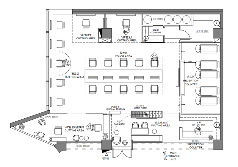
平面图